Introducing “Eastern Shore”, a 12.5″ by 12.5″ unfinished block, created for the New Block Blog Hop, sponsored by Paintbrush Studio, and hosted today by my quilty friend, Cheryl Brickey, of Meadow Mist Designs.
Paintbrush Studio (formerly Fabri-Quilt) has a new line of solids, called Painter’s Palette. And each blog hopper received six fat quarters of these colors: White, Peach, Coral, Bordeaux, Midnight and Daydream, to create a New Block for the 2016 Paintbrush Studio New Block Blog Hop. The hosts chose these colors, called Ocean Sunrise Palette.
They’re about 40 quilt bloggers who are participating. Today, these quilt bloggers are introducing their blocks. They’re all free patterns.
-
Host: Cheryl @Meadow Mist DesignsKim @Leland Ave StudiosAndrea @The Sewing FoolsCassandra @The (not so) Dramatic LifeStephanie @Quilt’n PartyIrene @Patchwork and PastryAbby @Hashtag QuiltSarah @Smiles Too LoudlyCarrie @The Zen QuilterJayne @Twiggy and Opal
I live in Virginia, and one part of the coast is called the “Eastern Shore.” Do you see the sun rising over the east coast of Virginia, USA?

This is a traditional block. It’s usually in two colors such as red and white. I created this Eastern Shore block pattern (click on link to get the pdf) to show you how to make it, using four of the colors: Peach, White, Bordeaux and Coral, from the Ocean Sunrise palette. Let’s get started with the cutting instructions.
But first, two important tips.
CUT ALONG THE SELVAGE
Why? The selvage side doesn’t stretch as much as fabric cut crosswise. As you sew the selvage-side strips, they will continue to be straight. The crosswise strips tend to bow and you’ll get curves instead of straight strips.
CUT THE LONGER STRIPS FIRST
Why? It’s more efficient. Once you finish cutting the longer strips, you can go back and cut the smaller ones, then the 1.5″ squares.
You’ll notice from the diagram that each strip is 1″ longer as you move up the block. In the diagram, I made the “White” strips in a light gray to make them easier to see.
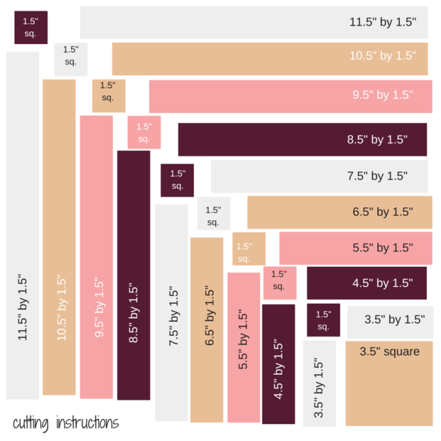
The color key and exact cutting instructions should help:

ASSEMBLY
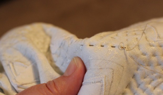
CHAIN PIECE EACH STRIP TO THE 1.5″ SQUARE
That means the 1.5″ Bordeaux square is sewn to the 3.5″ by 1.5″ White strip. The 1.5″ Coral square is sewn to the 4.5″ by 1.5″ Bordeaux strip and so on. Follow the diagram. The 1.5″ square is sewn to the strip to its right.

PRESS SEAMS OPEN
This will help you get nice straight seams.
SEW SINGLE STRIPS TO THE LEFT OF THE FIRST BLOCK
The 3.5″ square is first. Sew the 3.5″ White strip to the left side of the 3.5″ Peach square. Use a scant 1/4 inch seam.
SEW THE PIECED STRIP TO THE TOP OF THAT BLOCK.
You should match the seams. You should now have a 4.5″ block.
SEW THE NEXT STRIP TO THE LEFT OF THE BLOCK.
The next strip is the 4.5″ by 1.5″ Bordeaux strip. Then sew the Coral/Bordeaux strip on top.

There are nine single strips and nine pieced strips. Keep sewing the single strips to the left then add the pieced strip to the top until you have a 12.5″ inch block.
Some photos of the process:


This block is versatile just like a Log Cabin block.

I made some additional blocks, using the Midnight and Daydream colors. It’s fun to experiment with the layout.


Let me know which one you like the most.
(Or I could make 30 more blocks and put them together as shown. That would be fantastic).
Wanda