I found this very helpful piece from the Washington Post. I wanted to pass it along so you too can take control of your privacy– or at least a little bit of it.

I found this very helpful piece from the Washington Post. I wanted to pass it along so you too can take control of your privacy– or at least a little bit of it.

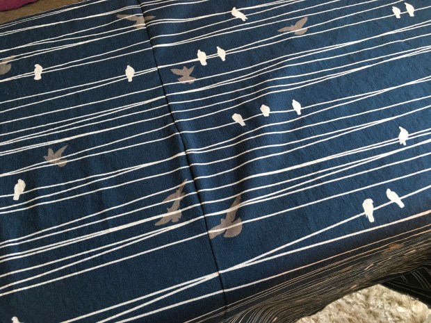
This was my first attempt to align fabric prints for a quilt backing.
I used a method I found on Aqua Paisley Studio.
First you’ve got to find where the repeats are and where you to align the two pieces of fabric. I don’t have a photo of that.
Second, fold fabric one-inch and press:

Third, apply glue to the bottom of the one-inch fold, then align:

Fourth, flatten the fabric out and sew on the seam where you pressed it:


Fifth, trim to one-quarter inch then press to one side:

Not bad for my first attempt:

I have learned that when modern quilters say “low volume” they mean a very subtle white or cream print.
When I started making blocks for do good stitches, I thought low volume meant low contrast white, gray or cream in relation to the bolder fabrics.
After making a not-so-low-volume block, I was instructed that my low volume wasn’t low volume.
THIS IS NOT LOW VOLUME:
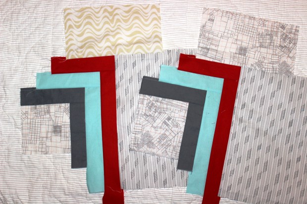
It was considered too dark and busy.
This month we are making cross blocks with “low volume” and black. I’ve figured it out.

Allison of Allison Sews Blog is this month’s leader and has a tutorial.
Some examples of “low volume” for the modern quilter:


